

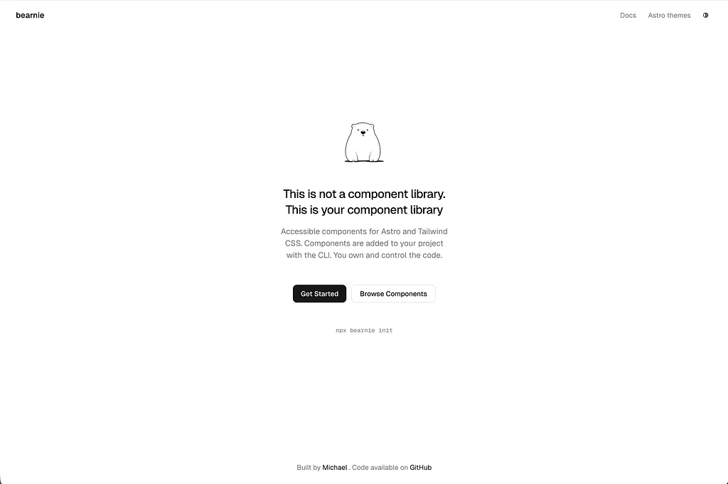
Bearnie - Astro component library starter kit built with Tailwind CSS
A copy-paste component library built exclusively for Astro with Tailwind CSS. Own every line of code — no npm dependencies, no framework runtime, just accessible, progressively enhanced components you can freely modify.
- Full code ownership
Components are copied into your project so you can read, edit, and delete anything freely.
- Accessible defaults
Every component follows WCAG 2.1 AA with keyboard navigation, focus management, and screen reader support.
- Zero client JavaScript
Static components ship no JavaScript by default with progressive enhancement layered on top.
- Dark mode theming
Customize colors with CSS variables and get light and dark modes working out of the box.
- CLI distribution
Add components to any Astro project instantly with a single npx command from the terminal.
- MCP server support
Let AI assistants add and configure components for you through the built-in MCP server.
- Open source
Freely available on GitHub with no version lock-in and no dependency update breakage.
- No framework tax
Built for Astro from the ground up using vanilla JavaScript with no React or Vue required.
Build your own Astro component library with full code ownership
Bearnie takes a fundamentally different approach to component libraries for Astro. Instead of installing an npm package and working around its opinions, every component is copied directly into your project as editable source files. You own the code completely — modify it, extend it, or delete what you don't need. Built from the ground up for Astro with Tailwind CSS, there's no React, Vue, or Svelte runtime shipped to the browser. Interactive features use vanilla JavaScript with progressive enhancement, meaning static components ship zero client-side JavaScript by default.
What's included
- Copy-paste UI components designed exclusively for Astro
- CLI tool for adding individual components to any Astro project
- MCP server integration for AI-assisted component management
- Flat-file registry defining components and their dependencies
- CSS variable-based theming with light and dark mode presets
- Button components with multiple variants (primary, secondary, outline)
- WCAG 2.1 AA accessible components with keyboard navigation and focus management
Ideal for
- Developers building custom Astro component libraries from scratch
- Teams that want full code ownership without npm dependency lock-in
- Astro projects that need accessible, lightweight UI components
- Developers who prefer reading and understanding every line of their UI code
- Projects where shipping minimal client-side JavaScript is a priority
Theming & dark mode
Colors are managed through CSS custom properties using the oklch color space. Light and dark modes are configured out of the box — define your palette once in :root and override values in a .dark selector. This approach keeps theming centralized and easy to adjust without touching individual component files.
Accessibility
Every component ships with WCAG 2.1 AA compliance baked in. Keyboard navigation, screen reader announcements, and focus management are handled at the component level rather than left as an afterthought. Since you own the source files, you can audit and adjust accessibility behavior directly without working around library abstractions.
Good to know
- Components live in your project directory, not in
node_modules— updates are manual by design - No framework runtime is required; all interactivity uses plain JavaScript
- Available as a free, open-source project on GitHub
Repository stats
- 0 open issues
- 359 stars
- 1 watching
- 14 forks
- 146 commits
- about 2 months ago



Stack
 Tailwind CSS v4
Astro
Highlights
- CLI component installer
- MCP server integration
- Flat-file registry
- CSS variable theming
Additional info
- License
- MIT
You may also like
Shadow Pro
$59Dark Tailwind CSS UI kit and template for startups
Harmony Pro
$69A fully equipped UI kit for your SaaS or business.
A fully equipped UI Kit for startups